Holistic Living app is a lifestyle app with the goal of guiding a user’s health in:
Nutrition
Plant based medicine
Sleep
Movement
Self care
Gratitude practice
Social support
The personalized app will help improve your health, create balance in your life, and achieve the highest potential of wellbeing for your body, mind, and soul.
User Research and UX Design for Holistic Living app
My role in this project.
Apart from the business owner, I was the lead designer in this project. This meant that I was in charge of:
User research
Personas
Information architecture
User journeys / user stories
Use cases
User flows
Sketches & ideation
Design
Prototyping
The Project -
Initial ‘How Might We’ Statements (Company Goals).
Initially when I came on board, the company owner already had spoken to ‘many’ potential users who had expressed their frustration at the abundance of information but lack of trustworthy sources in the realm of holistic health. I was provided with 4 HMW statements which the owner came up with for me to proceed with the design of the app. These statements are:
How might we help people understand the importance of their overall health, and what they need to do to improve their lives naturally & holistically?
HMW create one place for people to find all relevant content for Holistic Health?
HMW streamline the information available on the internet and provide the right data?
HMW build trust that the information, and people on the platform are legit?
I felt that these were great statements but wanted direct evidence from users- perhaps quotes even or statements that verified the problem space, need and direction for the app.
The initial plan that the owner wanted was for me to perform competitor and partner research and create categorizations of information that users would find valuable in the app. Only after that would we wireframe and test it with users.
I felt strongly that we should interview users first even if we were short on time, so that we could start with a verified direction instead of wasting time should that direction end up being completely wrong.
I suggested that we try to complete the interviews of 5 users within 2 days. We really needed strong user perspectives to work from. So we sent out a screener survey to the owner’s contacts to select the most ideal interview candidates.
The Project - Screener Survey For Interview.
I chose the survey methodology because I wanted some hard quantitative data on how common certain problems were, that could be validated with the relevant qualitative answers.
A screener survey was posted on Craigslist. 5 of 121 participants were chosen based on the most informative answers from the most ideal target users.
The Project.
The app would have these focus areas:
Knowledge database
Articles, videos, categories, recipes
Food & drinks, herbals
Shop
Products, supplements
Find a coach/business to help
Book a session with nutritionist, etc
Locate the acupuncture place etc.
The project would focus on the knowledge database component of the app, which would be the main offering and differentiator of the app.

Deliverables.
Define Target users
Secondary research on competitors
Primary research (user interviews selected from a screener survey)
Personas
HMW Statements
Define knowledge base categorizations- card sort
Sitemap
Ideate solutions
Red route definition
Design
Wireframe / Prototype
Secondary Research - Competitors.
Research found that there are not many apps that help deal with so many facets of a person’s health. There were, however, many apps that looked at a single or two components amongst nutrition/diet, natural medicine, sleep, physical fitness, meditation and mental health.
Natural Remedies.
A health app for a natural healthy life, with natural remedies, essential oils, healthy recipes, food, herbal teas, and health tips for natural beauty and skincare. There are also recipes for natural cosmetics, the latest news from science about nutrition and about living a healthy, natural life.
NATURAL REMEDIES: A list of plants, fruits and essential oils with explanations about uses, properties and benefits.
PROBLEMS AND DISEASES: List of the most common illnesses (allergy, poor digestion, acne, joint pain, nausea, anxiety, wrinkles and much more) with the related natural remedies.
HEALTHY RECIPES & HEALTHY DIET & HEALTHY FOOD: Every week there’s a new healthy recipe to try.
YOGA EXERSICES: For calmness and flexibility of the body, from beginners to advanced.
HEALTHY NEWS FROM SCIENCE: Last news from the science world about lifestyle, wellness, nutrition and health.
NATURAL TIPS: Health tips for everyday: video tutorials that show you how to prepare at-home simple natural remedies and natural cosmetics for your skincare and beauty.
CHROMOTHERAPY: Color therapy to induce relaxation before bed.
RELAXATION: Calming music sounds to relax your mind and body.
SITEMAP:
NEWS
Health - cooking tips, food properties and benefits, essential oils
From Science - studies on vitamins, minerals, diseases and prevention
Yoga, Pilates & Fitness - tips
Food - recipes
Beauty - natural beauty solutions,
MUSIC
Sounds
Music
SHOPPING
Article -> Link to Amazon to purchase
ROUTE 66
Articles that appeared on the landing page
CTA BUTTONS:
1. Problems and Diseases
A-Z of problems
2. Natural Remedies
A-Z of natural remedies
3. Essential Oils
A-Z of oils
4. Healthy Life
Healthy Food
Yoga and pilates
Video blog
Step Counter
Seasonal fruits and vegetables
Science news
Relax area
Color therapy
Sudoku
Tips and tricks for all seasons
5. Functionalities
Bookmark
Step Counter
Relax Area
Sudoku
Shop
The landing page has a carousel of articles on tips followed by shortcuts to news, sounds, shopping and articles.
The main CTA buttons take up half of the page followed by more shortcuts to functionalities.
The articles and tips are centered around health, lifestyle, beauty, and food.
3 of the 4 main categories of areas in the app contain information organized alphabetically. This makes sense to do especially in a resource heavy context.
The Route 66 articles are not categorized or organized in any meaningful way and include a variety of topics like:
Food and drink specialties from different cities or countries, and how to prepare them
Natural anti-aging treatments, beauty masks, and scrubs
Ayurvigyanam.
Ayurvigyanam: Ayurvedic Lifestyle, Diet and Home Remedies
Ayurveda promotes balance between mind, body, and soul. Ayurvigyanam advises on healthy diet and lifestyle habits and to bring the knowledge of Ayurveda to the masses. The app focuses on:
Body Type: Element energy types.
Lifestyle: Day regimens, night regimens, seasonal regiments, waking up, sleeping, working, eating, and drinking. Ayurvigyanam app provides knowledge about these regimens and encourages you to follow them by setting reminders in the Habit section.
Diet: Ayurveda believes each food has a specific effect on the body. The Ayurvedic diet focuses on eating according to your body type to prevent various health problems.
Home Remedies: Advice on ayurvedic home remedies to maintain health and heal minor health-related problems. Ayurvigyanam promotes natural methods for the self-healing of the mind and body.
Habits: Ayurvigyanam has a habit segment where you can set up reminders like wake-up alarms, drinking water, meditation, yoga, and more.
Consultation: You can consult an Ayurvedic doctor through the app.
SITEMAP:
PRAKRITI (Body type)
Sky, air, water, fire, earth
AYURVEDIC LIFESTYLE
Day ritual
Night ritual
Lifestyle
AYURVEDIC DIET
The six types of food tastes
Body type and diet
Healthy recipes
AYURVEDIC HOME REMEDIES
Skin conditions
Digestive conditions
Pediatrics
Endocrine conditions
Ayurvigyanam focuses on a specific practise of Ayurveda that aims to affect the complete lifestyle.
It is not very content heavy.
Wellville.
Website: https://wellville.eu/
WellVille is a website dedicated to general lifestyle articles on food, health, travel, fitness, events, with extras like videos and the ability to shop.
It is not yet content heavy but has all the features of building a community around its purpose.
SITEMAP:
FOOD & HEALTH
Recipes
Plant based health & nutrition
FITNESS
SPIRIT & TRAVEL
Destination
Gastroblog
Travel tips
EVENTS & WORKSHOPS
WELLVILLE TV (VIDEOS)
SHOP
PEOPLE
Partners - Gesund Durch Essen.
Partners are collaborators for the Holistic Living app. They will help provide information, products and services to the users.
Website: https://www.gesund-durch-essen.at/
Gesund Durch Essen is a website run by Monika Hofbauer, an alternative health practitioner offering services and information about health and nutrition.
She is a certified specialist trainer in nutrition, kinesiology and mycotherapy.
SITEMAP:
SERVICES & OFFERINGS
Appointments
Kinesiology
Energetic applications
Detox ion foot bath
Reading in consciousness
Honey massage
Lectures
Workshops
USEFUL ARTICLES
NUTRIENTS
Secondary plant substances
Vitamins and their effects
Minerals and trace elements
GROCERIES & SUPERFOODS
Superfoods
Omega 3 fatty acids
Remedies from nature
Medicinal mushrooms
Food
INTERESTING REPORTS & STUDIES
Screener Survey Results.
We ended up with 121 responses. It allowed us a surprising look into people's beliefs about natural remedies. The responses usually came down to a few conclusions which were enough to support a direction for the user interview. I used the screener survey answers as a basis from which to create interview questions to explore the topics further.
Most of the users surveyed were 20-40 years old and partook in healthy eating, physical wellness activities and some kind of naturopathic remedies.
Highlights Of User Interviews.
From the 5 users interviewed, these are some highlights:
Most people's source of information on health and remedies are from the internet and also meeting similar minded people who share an interest in natural health and living
There seems to be an assumption that not all remedies work for all people: “There may be no guarantee it’ll work for you”
A trustworthy source of information with cross referenced material is important
Challenges are information overload from so many different sources: “How do I trust the information I’m getting?”, “It’s just so hard to find and mine that information”
All users sought natural remedies for everyday healthy living and also resolving any health issues: “It’s all preventative”
Goals are to balance the best of both worlds in traditional and modern medicine, for preventative measures and to improve life overall
Affinity Map.
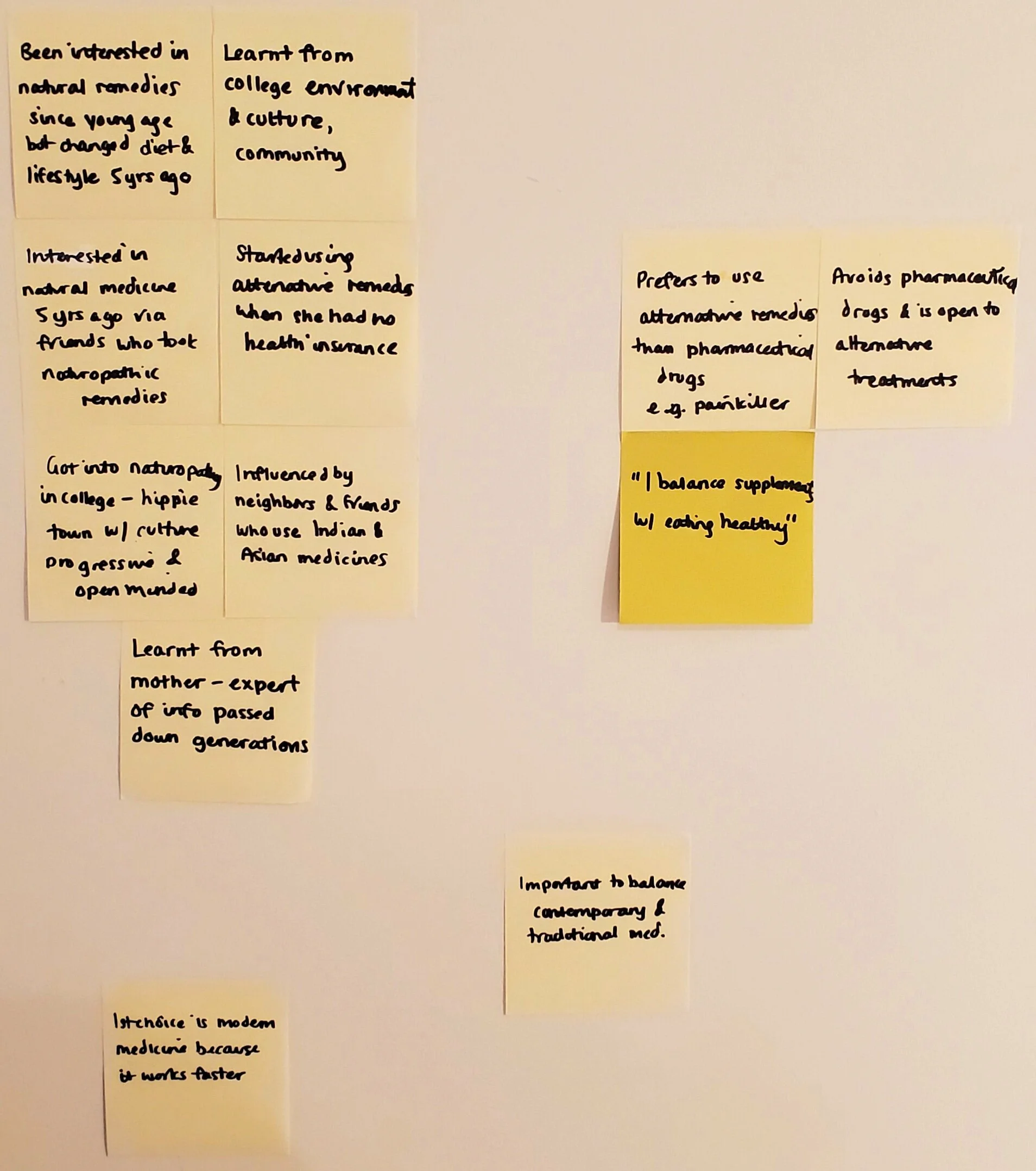
Following the user interviews, I created an Affinity Map based on the important comments, questions and insights acquired. I sorted these into like categories to figure out the most significant ones.
There is an overwhelming challenge in finding and filtering accurate and comprehensive information
Risks of balancing traditional with modern medicine are apparent. Bad side effects are of concern to users
Natural remedies are expensive
There’s an assumption that it might not work for everyone
There is a need to find trustworthy sources
Native and tribal sources are trustworthy
An opportunity exists in providing users with a platform that provides comprehensive, legit, science backed information and reviews
There is a desire for non chemical cures for general health and specific problems
Everyone has a daily routine of supplements and health practises
Everyone’s goals in pursuing natural alternative medicines are both preventative and targeted treatments to maintain their general health and well being
Most people are triggered to look for solutions if they start having certain health issues or ailments, but generally, they are curious to hear what else they can do to improve their health
Most people become interested in naturopathy through people and cultures they are immersed in
There is a general need to balance pharmaceutical medications with natural remedies

‘How Might We’ Statements.
Following creation of the Affinity map and identifying related problem areas from the user interviews, I gathered the insights and created some HMW statements to compare with the initial business goal statements. After comparing the new information against the original HMWs, two new questions were able to expand upon the first four in a more explicit manner:
How might we provide users with filtered, accurate and comprehensive information on natural remedies from trustworthy sources?
How might we help users in their daily pursuit of natural preventative care and targeted treatments to maintain their general health and well being?
Personas.
After synthesizing the interviews with users, I came up with two main user type personas who we would aim to create a solution for with the Holistic Living app.
These 2 personas would be the users who we would design the solution for.
Persona 1: Robbie.
Robbie is your average person who wants to try and pursue a natural, healthy lifestyle. He is trying to find a balance between modern medicine and prescription drugs he is told to take by doctors, while trying to find a healthier alternative way without ingesting chemicals.
Robbie will be our main focus when devising solutions to the problem space.
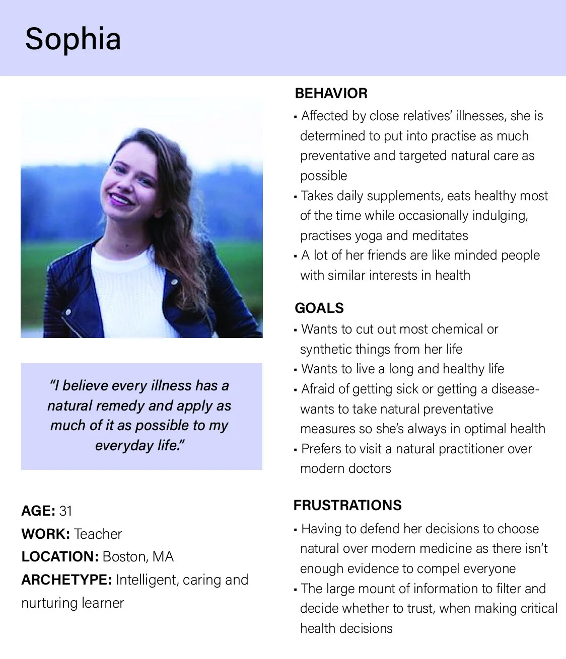
Persona 2: Sophia.
Sophia is on the more extreme end of the scale when it comes to taking naturopathy seriously.
She is a less common type of user but it is important to acknowledge this persona because they can be great advocates for natural and alternative remedies.
Sitemap.
I was given a site map from the owner that was already created. It encapsulated the entire app instead of only the MVP.
The area that I would focus on is highlighted in the red box on the next page.
Knowledge Base Categorizations.
Compiling information found from primary and secondary research, I came up with the following categorizations for the MVP knowledge base for Holistic Living app.
SUPPLEMENTS
BY ALPHABETICAL ORDER
BY PROBLEM / ILLNESS TYPE
USES, BENEFITS, PROPERTIES
SIDE EFFECTS AND INTERACTION W OTHER DRUGS (NATURAL AND PHARMACEUTICAL)
REVIEWS
VIDEOS
HERBS, PLANTS, FRUITS
BY ALPHABETICAL ORDER
BY PROBLEM / ILLNESS TYPE
USES, BENEFITS, PROPERTIES
SIDE EFFECTS AND INTERACTION W OTHER DRUGS (NATURAL AND PHARMACEUTICAL)
REVIEWS
VIDEOS
CULTURAL/TRADITIONAL REMEDIES BY REGION
BY ALPHABETICAL ORDER
BY PROBLEM / ILLNESS TYPE
MAP, BACKGROUND, OTHER INFO
USES, BENEFITS, PROPERTIES
SIDE EFFECTS AND INTERACTION W OTHER DRUGS (NATURAL AND PHARMACEUTICAL)
REVIEWS
VIDEOS
SCIENTIFIC ARTICLES
NUTRITION
DISEASES
HEALTH
VIDEOS
RECIPES
MEALS
SNACKS
DRINKS AND HERBALS
VIDEOS
NATURAL BEAUTY CARE AND REMEDIES
BY ALPHABETICAL ORDER
BY PROBLEM / ILLNESS TYPE
VIDEOS
ESSENTIAL OILS
BY ALPHABETICAL ORDER
BY PROBLEM / ILLNESS TYPE
VIDEOS
FITNESS
BY ALPHABETICAL ORDER
BY PROBLEM / ILLNESS TYPE
VIDEOS
MINDFULNESS AND MEDITATION
BY ALPHABETICAL ORDER
BY PROBLEM / ILLNESS TYPE
VIDEOS
VIDEOS (UNDER EACH OF THE ABOVE SECTIONS, AND ALSO IN ITS OWN SECTION DIVIDED INTO CATEGORIES)
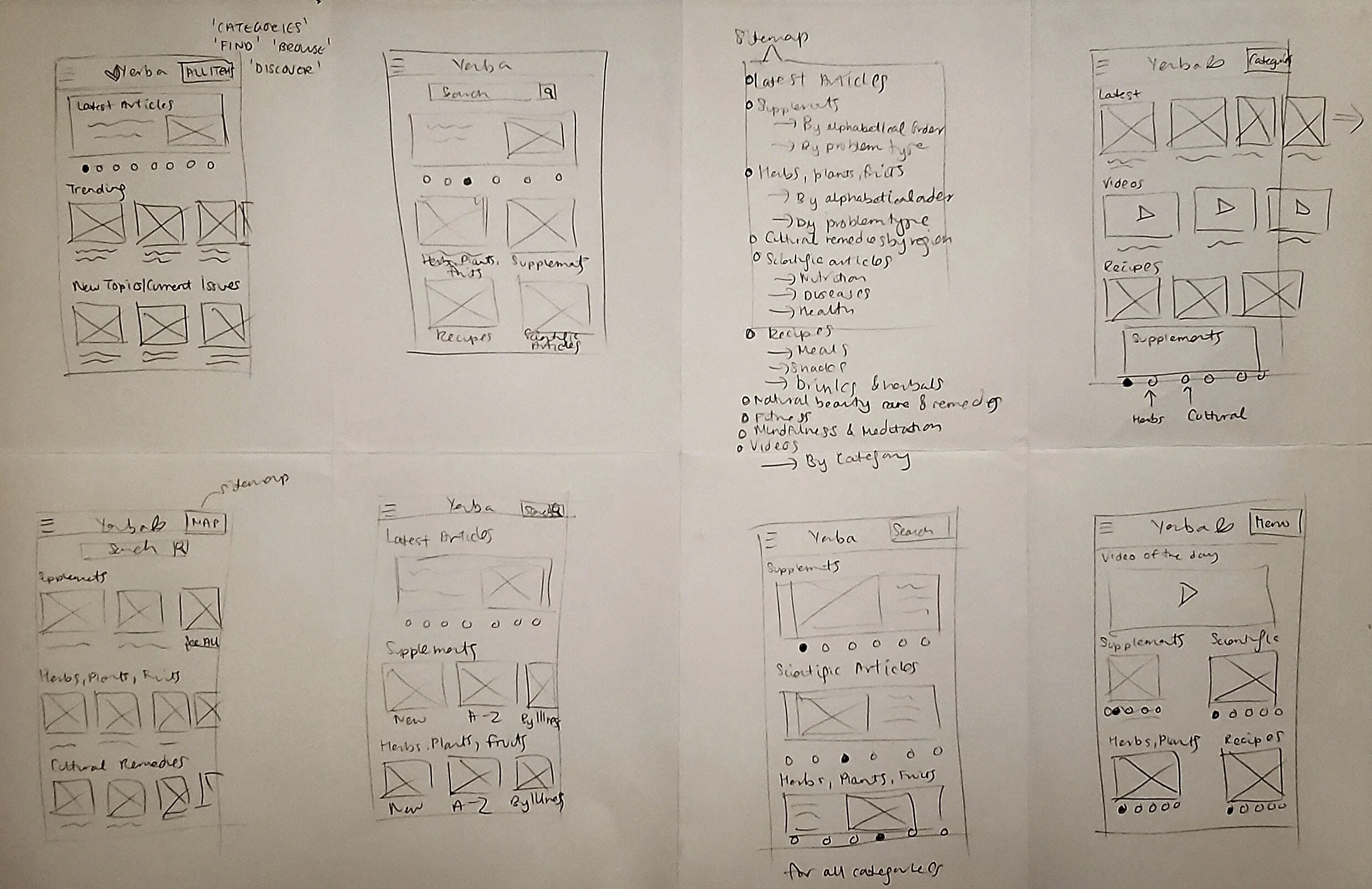
Ideation Sketches.
I sketched some ideas on paper with the structure of the owner’s previous app, Liquid Market, in mind without letting myself be constrained by it. This was intentionally done before I came up with the red route definition, to allow for more creative ideation.
There seemed to be common ways to display knowledge based app information, as gathered during secondary research.
User Flow.
I created a simple user flow to show the user’s journey from launching the app to successfully finding an article of interest to them. This user map applies to all user types and forms the main red route of the user journey.
Design - Moodboard.
The moodboard was inspired by vibrant colors that appear in nature- greens, yellows, corals, pinks and blues. The pastel and muted colors provide a vibrant and gentle atmosphere. The font chosen- Quicksand, provides a simple, modern and organic feel with its rounded edges.
Designing Hi Fidelity Screen Mockups.
The 4 screens to be designed into hi fi mockups were:
Launch screen
Categories screen
Results screen
Details screen
I used the Materials.io Sketch design package to play around with the UI design.
UI Design.
Using colors I had selected from the moodboard as well as the typography, I created a simple logo of Holistic Living spelt out with 2 leaves drawn in Illustrator. The logo was designed to be synonymous with the app’s purpose: a modern app to help simplify people’s natural health management and information. In the app, I gave the logo a slight shadow to add depth and texture.
UI Design - Screens.
Launch Screen:
The launch screen message is simple but effective, with the logo clearly visible in the center, and added shadows to create depth.
Results Screen:
The search function was initially taking up a lot of space on the screen in the design for Liquid Market app as well as competitor apps. Since the search icon is universally recognized, I decided to take the search box out of the main screen and add an icon to the top right menu area instead, to launch a search.
The results screen is viewable as all or by each category, and includes a thumbnail and short text preview presented in a clean and readable format.
Main Categories Screen:
The main landing page of the app is the categories screen where I chose to showcase the latest articles as a dynamic carriage of featured images and corresponding articles. This is to preserve precious space on the landing page as well as allowing for users to quickly scan for articles of interest.
The remaining categories are standardized into their sub categories across the screen for easy navigation. Because there are many categories in the knowledge base, I added a “Go back to the top” navigation link at the bottom.
Detailed Article View Screen:
The detailed article view screen is presented with a relevant image before it proceeds to the article title, and icons to ‘Favorite’ and ‘Share’. A visible back button with high contrast easily navigates the user back to the previous page.

Summary & Key Takeaways.
The most important lesson I learned from leading this UX design project was an appreciation of how critical user research is to gather data and create user personas verified by real potential users. The initial business assumptions about user needs were pivoted and refined following the user interviews and insights.
The focus, priorities and attitudes of the users had not been realized. Many new insights were found about the users and the market. Valuable user behaviors, attitudes and pain points were discovered from the primary research. The new insights were critical to creating a meaningful platform that users would actually use and value.
Conducting the interviews in addition to competitive research also helped to identify critical knowledge base categories that were being ignored by a lot of existing apps and websites.
All 5 users interviewed expressed interest in the app and the next phases of testing. They are likely to become early adopters of the app and help share the experience with their communities.
Although we didn’t have enough time to perform user testing of the 4 critical screens, I’m really glad that I pushed for the user interviews to understand the problem at stake much better, and with confidence.
Lastly, the owner expressed that she would have liked more versions of the UI in different color combinations after I delivered the final UI. Had I more time and if this desire had been expressed early on, I would have tried to accommodate for this. I learnt that it is absolutely crucial to have clear expectations of deliverables set early on.


